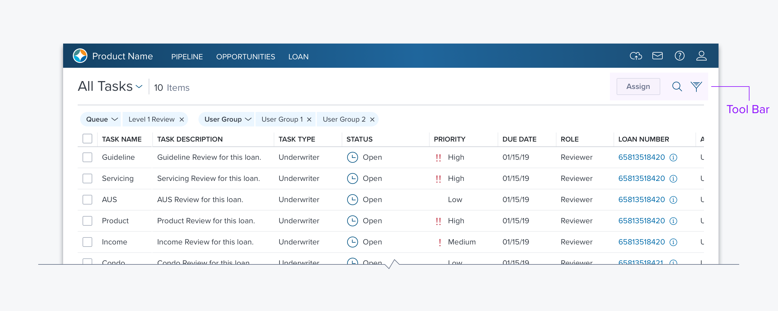
Toolbar

Overview
Toolbars are used to present actions (Search, Print, Move, Delete, etc.) and/or links to related content (Calendar, Settings, Details). They provide a flexible container for many of the DimSum controls including Buttons (all types), Combo Box, Search Box, and Toggle. Toolbars present their contents progressively by opening on hover or click where and when they are needed in a manner that is scalable.
Usage
- They are always associated with a container such as a page, group box, card, dGrid, or dGrid row.
- Use a Toolbar when you have a fixed set of actions and will always have enough space to display them all, (the toolbar is used in dGrid to provide row-level actions).
- Use the MiniToolbar where a responsive solution is required to handle viewports that can be resized (e.g. page header, group box header, and accordion header).
Alternatives
- An icon button can be used in place, where a single control is needed and it is always in view.
- The grid component can be combined with two or more icon buttons to create a basic toolbar that is always in view.
Types
- Toolbar animates open when the user hovers on the vertical ellipsis icon that triggers it. It has a fixed size based on the icon buttons that it contains.
- Mini Toolbar is a responsive solution consisting of a drop menu and one or more shortcuts in the form of icon buttons. The dropdown includes icons and labels for every action that is available. The app designer can decide which if any of the menu commands will get shortcuts in the form of icon buttons.
Updated almost 4 years ago
Did this page help you?
